WHAT MAKES A GOOD LOGO?

If you think your logo is the most important part of your brand, you're not alone. Most people focus on creating a cool logo and miss what’s actually needed to turn it into a badass logo that people recognize and love.
 

logo versus brand worstofall design

Most people focus on creating a cool logo and miss what’s actually needed to turn it into a badass logo that people recognize and love. In the small business space, it has everything to do with how you communicate what you have to offer in a clear and meaningful way.
 
It has almost nothing to do with your logo!!
 
The problem is we small business owners are looking up at huge companies for ideas of what we need to succeed.
 
But we are not them, and they are not us. And we aren't even headed in the direction to be them! Because most of those example brands you are looking at are products.
 
But you are a service.
 
And even for the huge badass brands of companies that sell products- even their logos aren't the reason they are successful. It's the brand that made the logo what it is. For example:

NIKE: THE GODDESS OF VICTORY

Case in point: Nike. When we think of Nike, we think of the swoosh. So it’s no surprise that most people equate the power of a brand with the power of the logo.

I mean, what a brilliant logo, right?

WRONG!

Sure, there’s a story behind the shape of the logo, but people don’t buy Nike because of the swoosh.

The logo is brilliant only because of the behemoth brand that backs it up. Apparently a student designed the swoosh for $35 in 1971—what a steal! But it wasn’t really a steal. Nike made that logo brilliant by positioning the company in the market, and then pumping cash into smart advertising campaigns over decades.

The swoosh might as well be some weirdo abstract creature that has nothing to do with what it’s selling, like the mermaid on the Starbucks logo. It’s iconic because the brand made it iconic.

The logo is only one small part of the brand. Yes, a bad logo can hurt your business. And a brilliant logo that makes people stop and think, “Hey, that’s cool,” will have customers think about you for an extra millisecond.

But a logo does not a brand make. On the other hand, a great brand can make a plain logo seem absolutely brilliant.

Too harsh?

Why are we being so harsh on logos? After all, we love designing badass logos, and it’s fun to come up with a smart logo that encapsulates the brand’s essence into a single mark that, over time, the consumers will recognize sans the company name. That’s pretty cool, and that’s what all businesses want.

We’re being harsh because we don’t want you to spin your wheels on getting the perfect logo in lieu of building the brand that’s actually going to make that logo sing. Yes it's important that the logo is in line with your brand's positioning (a nice luxury font logo for a premium priced brand makes sense while a childish font would not) but once it's in the right vicinity, we find no "perfect" logo is going to make your company successful.

10:1 RULE

So what makes a good logo? The brand behind it. Go ahead: Put effort into a logo you can be proud of. But don’t do it if you’re not going to put ten times the effort into a brand that’s going to make it work for you. Stop spending time on your logo, and start spending time on your brand: your logo will thank you.

Most people think if they have a badass logo, they also have a badass brand! And while a cool logo can take you far, it is most certainly not a brand, and understanding the difference can open your eyes to new opportunities for growing your business.

Below are 4 key differences that can help you determine if you have a brand or not, and when you need one.  

OK, BUT WHAT'S THE DIFFERENCE BETWEEN A LOGO AND A BRAND?

What’s a logo? A mark that represents your company.

What’s a brand? The reason your logo has any meaning at all. It’s the value, feeling, and personality of your company that your logo will come to represent if you market the brand consistently over time.

A logo without a brand is just another mark.

1. A LOGO IS A MARK, A BRAND IS YOUR STORY

A logo is the mark that identifies your company whenever it’s presented.  It’s the mark that goes on top of your website, your business cards, and your products and packaging. A logo is one very important part of your brand.

A brand is how consumers perceive you. It's the sum of your company’s touch points and includes everything your customers come into contact with. It's the main message and idea that influences everything you say and do, how and where you market it, and of course, all the visual elements of your business (website, business cards, marketing materials...)

An important point most people miss is that a brand is not about what you are selling, but why people care about what you’re selling. It’s about the emotional need you are fulfilling. 

Think about your brand as a story. Who are you, and why should people care?


2.  A LOGO WILL HELP YOU START A BUSINESS, A BRAND WILL HELP YOU GROW A BUSINESS

You can start and build a business with a logo, and as a solopreneur just by operating you are your default brand because you are your business, and people can’t help being themselves pretty consistently. If you’re a reliable, hardworking person with a great product, you’ll probably do alright! Although if you rely on your personal awesomeness to develop your business, it will mean that you need to spend quite a bit of time with each lead for them to fully understand why you’re great.

When you start hiring employees and outside vendors who will also be selling your services (social media marketers, for example), a brand is crucial to making sure that everyone is selling the same thing, with the same message. Even if it continues to just be you, if you are utilizing online marketing techniques (social media, blogging, webinars, newsletters, etc…) a brand will make sure that all the content you put out there is consistently telling the right story, reinforcing the main overall message of your business. That consistency is what develops relationships with people overtime, be they current or potential clients. The longer you reinforce your message, the more awareness you bring to your business and that awareness multiplies overtime and translates into sales.


3. A LOGO INFLUENCES YOUR VISUALS, A BRAND AFFECTS AESTHETICS, AND MORE

Since the logo is the sum of the brand's visuals, we usually start by developing the perfect logo mark and then build the entire visual brand around it. But that visual brand does not directly reference company culture or messaging. Again, when you have a brand message, it influences every decision you make as a company (For example your pitch; your homepage copy; how and where you market. A few less obvious ones might be; how you structure your work days; where you have a company holiday party or host promotional events; what kinds of events you sponsor; what charities you support; the kinds of gifts you give...)


4.  A LOGO IS MORE AFFORDABLE THAN A BRAND

Unless you have an investment with which you are starting your business, developing a brand before you’ve actually set up shop is usually not possible given your limited resources. When we help growing businesses create a brand, we have a lot of information on which to base that brand message; past experiences can shed light on the actual needs of the consumer (as opposed to the needs you think they have.) 

That said, having a brand is powerful.  If you have a clear and strong message, and brand elements that strengthen that message (i.e. a badass website, super professional business cards, eye catching mailers…) selling is much easier.  Many industries sell their good based almost completely on their brand. Clothing and jewelry, for example, are a dime a dozen, are non-essentials, and consumers in these verticals buy  based on the brand equity more so then in service-based businesses. The whole buying experience needs to make consumers feel great because they don't need to buy this item. And that experience is shaped by the brand. 

But out of the gate, when you are starting a business, there are so many other things that need your time and money. So when boot strapping the business, it’s usually not feasible or the best use of your limited resources.  After all, a great brand without a great business has nothing to sell. Here's an article about how much branding costs, and you're just starting out, check out our Brandshrink or  Brandup, an affordable way to get everything you need, including a responsive website if you're not ready for the full shabang.

In the end you will need both, but when you are a small business, doing a full branding project is often not affordable.  If you use a logo designer that knows about branding, elements of your overall brand message will still be discussed and explored to achieve the right logo anyway. A brand will always be more powerful, but companies don’t usually have the resources to develop one when first starting out.  When you’re ready though, a brand is necessary and will help take you where you want to go!

ARE YOU BORING?

Boring is probably the worst insult you can get. I think most people would rather be mean or rude than boring. Boring means nobody cares to think of you because there's not much to think.

So why do so many businesses settle for being boring? 

Here are three common things businesses do that make them boring and bland, and what to do instead if you want to titillate your audience

worstofall+design+interesting+badass+branding.jpg


1. Use superlatives

Unless a reputable source said it’s so (and you can cite them), saying you are The Best at anything is pretty lame. How do we know you’re the best-- because you said so? Of course you’re going to say that, you’ve got a pretty obvious agenda.

INSTEAD, TRY THIS:
Give some specifics. Whether it’s Geiko saying they will save you 10% or more on car insurance (instead of saying they are “the cheapest”), or Dominos saying they will deliver your pizza in 30 minutes or less or it’s free (instead of saying they have fast delivery), Specifics are more believable and will go much farther than some generic claim with nothing to back it up or compare it to.

You can also say something entirely different and badass- but that’s a different article.


2. Write too many words

Unless we are sitting down to read a book we actually want to read, we don’t want to read. So if you can’t sum up your point in a few sentences or less, don’t bother writing it.

And break up your points with paragraphs.

And use headlines.

Because they are easier to read, and lots of words are boring.


3. Talk about yourself

It’s hard not to talk about ourselves, after all we are the inspiration and the reason for our business' existence. Maybe compare it to being ones child, an extension of ourselves. We are the center of our own universes, and it’s a habit that’s hard to shake.

So it’s no wonder that everyone has their bio, their story, and their history all over their website. It’s the story we know, and it feels important.

But you know what is interesting and important to me, the customer? What you’re going to do for me. How looking at your website, or learning about your company, is going to benefit me.

Us customers are not just self-centered a-holes, and it's not as cold and sad as it sounds. It’s actually quite wonderful! It’s the reason businesses exist: to create and give value to others. It’s a noble cause that comes with a perk of being able to support yourself monetarily.

So do us a solid and talk more about the value you created for us, and how it’s going to help us, and stop telling us about your hobbies and pets and how long you’ve been in business (I don’t want the oldest company, I want the most effective company for solving my problem.)

Your customers, and your bank account, will thank you handsomely.


THE GOOGLE APOCALYPSE: IS YOUR WEBSITE GOING TO BECOME EXTINCT?

Since April 21st, 2015, Google started taking mobile-friendliness into account when ranking website, and this change promises to have profound and widespread impact on the web and how we search.

_32.jpg

This means if you don't have a responsive website, (meaning the website adapts to the screen size on which the viewer is looking, readjusting images and text so you can just scroll down to find information instead of zoom in) you are a dinosaur according to Google.

Why are they doing this to us?! You might ask.

Google dominates the search engine space because it's so damn good at adjusting its algorithm so that you almost always find exactly what you're looking for. Since more than 50% of web cruising occurs on mobile or tablet devices, and looking at your dinosaur website on a phone sucks, Google is ready to tell you you need to shape up or ship out. 

Responsive websites have been around for a few years now, so we don't want to hear your sob story. But we understand life gets in the way, you been meaning to redesign your site and make it mobile friendly and you just haven't had the chance.

Well, Google is giving you a great reason to now.

Now we know, starting a new website project feels like a big undertaking. You aren't looking forward to spending the next 3-6 months going back and forth with a designer, and then a programer, to get this thing up.

What if you could have it soon? I mean, IMMEDIATELY? That's why we invented the Brandup. It's a 1, 2 or 3 day intensive where we design and build your brand and entire responsive website so you can get back to business. Read about it here.

If you need to solve this problem soon and you don't want to waste 6 months doing it, schedule a call and see if a Brandup is right for you. If you know you're ready, you can take the first step and schedule a Brandshrink to get started.


5 REASONS LISTS WORK

Articles and newsletters are a great way to stay in touch with your network, but how do you get people to read them? Try writing in list format, it's easier than it sounds and makes a world of difference. Here's why:

1. We've Got Shrinking Attention Spans

Many of us have an obsessive need to check our phone and email constantly, and the distractions online make is difficult for us to focus sometimes. Feels like we've all got ADD! When there's a list, at least we know we'll get the basics even if we get distracted before we finish the article.
 

2. We Want Easy Answers

Who doesn't? Sometimes the only way to attack a difficult challenge is to make a list of simple steps, and likewise when we are faced with a challenge, we find it comforting to see that there are really only X number of things we need to think about to fix it. Breaking it down so it's easier to digest is a sure way to get people reading.


3. Lists Immediately Tell the Reader How Long The Commitment is Going to Be

Ever notice when you're taking a survey that they usually let you know the page you are on and how many pages there are total? This practice is common across many forms of communication from websites to books. That's because it's been proven that when one doesn't know how long a process is going to take, we bail sooner and out of frustration. If you want someone to finish a survey, or look through a slideshow, or read through an article, letting them know at the beginning how long it's going to be actually encourages them to stay to the end.


4. We Don't Read Linearly Anymore

At least, not online. Our eye scans and jumps around to get the gist before we commit. Studies show that the way an email is read is as follows: 

1) Read the subject, decide it's worth opening.
2) Read the intro line, decide it's worth moving forward
3) scan the headlines (or list titles, in this example), see if you want more info
4) read the paragraphs of the headlines that intrigue you
5) Maybe read the conclusion (step 4 might be eliminated for the super-time crunched)

So if you want to get a point across, make the bolded headlines the most important points.
 

5. Easier to remember

We've got information overload, so a list is a great way to have the main points stick in your head. It's valuable to actually read the information about each topic, but the topic itself will help you recall that information more quickly.
 

Conclusion

Want people to read your carefully crafted article chock-full of valuable information? Try breaking your points into list form, at least once in awhile. More people will open it purely out of curiosity to see what your believe those 5 most important blah blah blahs are. (You clicked on this one didn't you?)

3 NEW WAYS TO BUILD AN AUTHENTIC BRAND

A lot of companies talk about being authentic because we all gravitate to organizations that feel honest; it’s refreshing and builds trust. But today the guy who says “trust me, we're honest” has the opposite of the intended affect.

Being Real Isn't as Easy as it Sounds

_17.jpg

In branding, authenticity is defined as delivering on your brand promise. Say what you are, and relentlessly back it up. Of course you must have a brand promise to begin with, which means standing for something in everything that you do. It's actually the opposite of being exactly who you are, because if you show all the different aspects of your company, you will confuse your customers who won't understand what you "authentically" stand for. As a person, you're complex and hard to define simply and quickly, but your brand message should not be.


3 Obvious/Not Obvious Ways to be Authentic

1. Don't Say You're Honest, BE Honest

Not because you are dishonest, but because everyone says they are honest (and nobody says they are dishonest). This white-washed message carries little weight in the eye of the consumer. To be authentic, you must instead demonstrate your honesty through the actions and behavior of your brand. Don’t say anything you aren’t 100% confident you can back up.

EXAMPLE: JetBlue

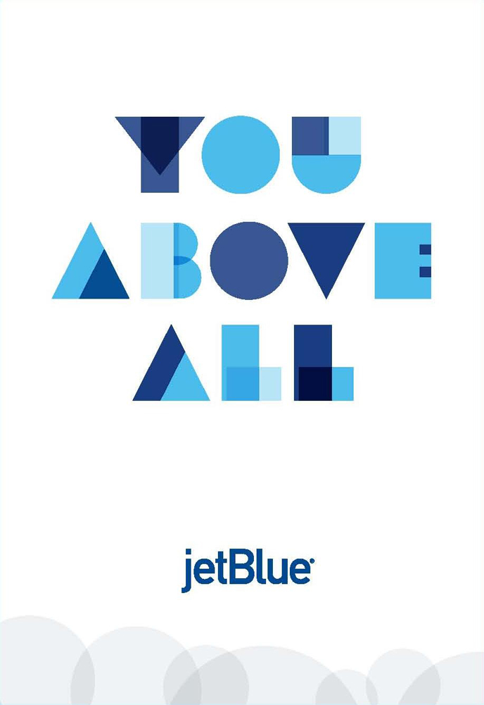
"You Above All"

All airlines say they are about the customers, but JetBlue does an amazing job of making all of their company decisions in line with their brand promise. Fewer rows in each plane for more legroom, first bag checked for free, unlimited free snacks and Direct TV. This is a brand that you really believe puts “you above all” and the success of their company is not unrelated to their badass authenticity.

Those authentic actions become stories told to friends, increasing the people in your sales pipeline over time. Conversely, not fulfilling your brand promise through actions makes that an even more fun story to share, and not in your favor. And that means lasting damage to your image and business.


2. Owning a Negative Has Just as Much Potential

Since everyone says they have great customer service, their product is the best, yadda yadda... these messages can start to feel trite and, at times, even dishonest. 

In the last few years, Dominos has been playing up their less-than-gourmet pizza in an ad campaign, inviting, and then showing off, all the brutal criticisms. This vulnerability and honesty about their product worked, the campaign (and new recipe) catapulted the chain’s stock price from $12 per share to more than $75 in 4 years.

Being authentic in this way very badass. It takes guts to show your flaws and being unapologetic about what it is your company really cares about and what it doesn't care about, which are equally important. This approach to branding inherently makes your business stand out as different in the face of a sea of corporate jargon and bland sameness. Keep it up and don't fall into the vacuum of status quo; that continued effort will build your authenticity over time.


3. Terrible Situations Are Your Chance To Be “Authentic”

You don’t have to be perfect, quite the opposite! When hiccups do happen (and they do for everyone), look at it as an opportunity to flex those muscles and show customers those benefits you have been selling. By handling the situation in line with your brand promises, you'll get everyone raving about your great customer service before you have a chance to brag about yourself (*note: bragging sucks, other people bragging about you is delicious)


Conclusion

Authenticity is built by how a company acts everyday with every client interaction, not by saying it's so. Be it a luxury company whose touch points are always dressed to the nines, or a service company who always responds to email within 30 minutes (even if just to say you will get back to your customer with an answer shortly). Being yourself, or "authentic", takes direction, planning, and consistent effort.

DON'T BE RALPH LAUREN, BE RALPH LIFSHITZ

"RALPH LAUREN, APPLE, NIKE AND STARBUCKS"

Almost every business that walks into our studio mentions how they aspire to be a brand much like the 4 listed above. We always appreciate our client's ambitious branding goals, but take the time to remind them that these companies did not become universally loved by selling to everyone when they started. 

Instead, they started by selling a very specific product and idea to a very specific group of people and, more importantly, that product or idea was something bold and different: Badass.

If you really want to own a brand like Ralph Lauren, then don't be like Ralph Lauren.


HOW DID THEY DO THAT?!

RALPH LAUREN

Most people aspiring to have a brand like Ralph Lauren's don’t know that he started out as Ralph Lifshitz selling ties out of the back of his car. His angle? He wanted to allow men to make a statement with their ties. And unlike the skinny plain ties of the time, Ralph Lauren’s wide ties were colorful and made of luxurious materials. Being bold and different lead to being recognized and remembered, the foundation of a badass brand.

APPLE

Apple had decades of almost going bankrupt. It’s rise to Brand Superstardom came after almost 30 years in the business, staying true to their mission to simplify the complex so that everyone will be part of the future with computers. They dug in as the more intuitive, creative computer choice, which feels obvious now but was a bold, risky stance to take at the time. Apple's current success eclipses how difficult it is to take a stand as something different or other, but illustrates how big the payoff can be.

NIKE & STARBUCKS

Nike was known as Blue Ribbon Sports for the first 7 years of business, and only sold running shoes for more than 2 decades, and Starbucks sold coffee beans for their first 10 years in business.


HOW DOES THIS RELATE TO ME?

When starting or rebranding a new company, don't look at the biggest, oldest, most successful brands as they are today as your model. When you look at how they started and what they did to become the recognized, global brand, you will find lots of boldness and badassery.

These companies all started with a simple badass mission and narrow focus rife with game changing vision.
 

HOW DO I FIND MY BOLD BADASS SAUCINESS?

Do you want to own something that people will remember? Are you ready to think about WHY people will think about you above all others? Think about a Brand Shrink to get some insights into what makes your company Badass.

WHY MARKETING WITHOUT BRANDING WILL LOSE YOU MONEY EVERY TIME

When your brand is bland, your marketing dollars are like The Little Engine That Could - gone terribly wrong. You'll just keep chanting I-think-I-can, I-think-I-can indefinitely, never really able to push the train over the mount…

When your brand is bland, your marketing dollars are like The Little Engine That Could - gone terribly wrong. You'll just keep chanting I-think-I-can, I-think-I-can indefinitely, never really able to push the train over the mountain!

Badass Branding saves a "cookie" in your customer's mind. 

Have you ever gone to a website, and then realize that ads for that company keep popping up on other websites you visit after? It's a kind of online marketing called retargeting where the website downloads a "cookie" on your browser that follows you around, reminding you (a prospect) about the product/service you looked at. When you have a badass brand that is noticeable and memorable, it downloads a cookie into your prospect's head. 


Try It For Yourself

Think about the last time you saw something really cool, something that really stood out to you as interesting and different. Did you think about it afterward? Maybe take a second look later? Possibly share it with someone who also might be interested?

What if everyone that encountered YOUR business had that experience?
Would your business benefit? 


The Blind Spot

It is enticing to want to spend every dollar you can on marketing your business and bypass the brand, particularly if you think a brand is just a "nice to have." After all, you want to increase sales, and marketing seems like the most direct way to sell to consumers.

But being short-sighted is not good for business. Marketing will make a sale today, but the brand is what sells today, tomorrow, next quarter, next year, 5 years from now...

Would you rather your marketing dollars pay for sales today? Or sales today and forever moving forward?
 

Marketing Without A Badass Brand Makes For a Steep Uphill Climb

We all invest money in our companies because we want to increase sales, but it's important to understand the role each plays in the sales process.

Marketing: How people find you

Branding: WHY people buy

Sales from Marketing: The way anyone becomes aware of what you're selling. You can't buy something you don't know about.

Sales from Branding: The reason someone buys from you instead of the next guy, and buys in the future, too. If your brand sticks out in my mind, I will remember you and come back when I am ready to buy, or ready to buy more.

Branding without marketing will make you the best kept secret, but some people will still find you. Marketing without branding, on the other hand, will burn out your engine and your capital. 

It's not that you you won't have to pay for marketing when your brand is badass, quite the opposite. Once you have a brand that supercharges your marketing efforts, the ROI will be so damn good you'll be happy to invest more into it. 

Instead of pushing your train uphill forever, investing in your brand will take all the potential energy you've built up with your business and turn it into sales for years to come.


WHY YOU DIDN'T GET WHAT YOU WANTED

MODERN. PROFESSIONAL. CLEAN. SOPHISTICATED. COOL. 

Everyone wants their brand to be at least a couple of these things. But what does Modern, Sophisticated, Professional, Clean + Cool look like? 
 

PROBLEM: 

Words often only give the illusion of communication and understanding; we all think we know what "modern" looks like, but we all think something different. 

Two very different examples of "modern"

Two very different examples of "modern"

SOLUTION:

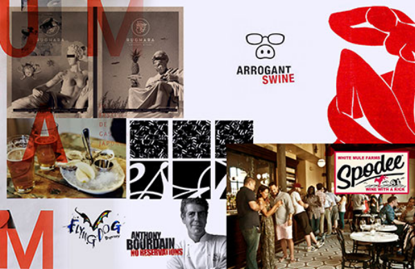
Mood boards get the client and the designer on the same page.


The mood board gives us a chance to understand, for example, whether or not our definition of “modern” matches up with their definition of “modern" (see example above.)

They create a foundation of understanding by agreeing on the definition of the most crucial sentiments that will inspire the creative work. Without such agreement, it's likely a designer and a client will have different ideas of where the project is headed, leading to the client feeling like they didn't get what they paid for.

And it’s why, time and again, our clients tell us our first round of brand concepts is spot on. Here are 4 examples of mood boards designed for our clients, ALL of which can be considered modern and sophisticated. However, each contains its own distinct imagery and style that represents the values and personality of each individual brand.
 

This brand is futuristic and aggressive with an emphasis on mobile devices since it is an app.

This brand is futuristic and aggressive with an emphasis on mobile devices since it is an app.

This brand is more artisan, with a handcrafted feel and imagery to match since it is for a specialty food product. 

This brand is more artisan, with a handcrafted feel and imagery to match since it is for a specialty food product. 

This is a colorful, friendly and community-based board for a upbeat company that provides services for non-profit organizations

This is a colorful, friendly and community-based board for a upbeat company that provides services for non-profit organizations

This board is elegant and minimalist, but with natural texture for a jewelry brand that uses uncut stones. 

This board is elegant and minimalist, but with natural texture for a jewelry brand that uses uncut stones. 

You can also check out the approved mood boards at the beginning of these 1st round brand presentations, and then see the brand concepts that followed. As you can see, mood boards are crucial to getting on the same page with your design firm to ensure you are happy with the results!

FREE LOGOS!

Did you know that Squarespace has a logo generator that offers free logos to anyone with a site? ($10 for none SQSP users). This and other cheap logo alternatives, like fiverr or logo contests like this one, has outraged lots of people in the design world. 

We think it's great! 

For the right people, this is an awesome tool and we think you should share it around. Better to use the SQSP generator (and copy their business card mock ups) than make it yourself. The built-in constraints will make it cleaner than what a non-designer would make on their own.

Doesn't this undercut the value of Worstofall Design's work?

Of course not! Here are 4 reasons why this platform is not only awesome, but should be saluted by everyone in the small business, design and branding world.

Cause we're in Brooklyn, so we're probably all perfecting our mustaches

Cause we're in Brooklyn, so we're probably all perfecting our mustaches


1. IT WILL INSPIRE MORE BADASS DESIGN WORK, IN GENERAL

Photoshop has made some things very simple for those who know how to use it. This means the design world has a low barrier to entry since anyone with Adobe Creative Suite can open up shop and call themselves a design, or even a branding, company.

This logo generator makes clean design even more accessible to people who don't even know photoshop.

But these tools ultimately weed out the designers who don't necessarily have value to add. It means that designers need to up their game to compete, and that should inspire higher and higher quality work. These programs push creatives to be creative again, and it's being fought because true creativity requires thought, and it's hard. Designers: don't fight it, embrace it like any real creative would and make something new.


2. IT WILL MAKE BADASS DESIGN WORK STAND OUT THAT MUCH MORE

If you go on SQSP and pick a font and logo for your company, you will quickly see why those decisions require expert eyes. Once you see how difficult it is to make something new, it will make you appreciate the value and price tag for hiring professionals. Similarly, if one goes through that exercise and doesn't end up seeing that value, but rather thinks 'why would I pay thousands of dollars for a logo when I got this one for free?!'  then this service if perfect for you.

Cause we're dreamy?

Cause we're dreamy?


3. TIME IS MONEY AND THIS MAKES THE SYSTEM MORE EFFICIENT

Since everyone starting a business needs a logo, but many don't have a budget for it, there is much time wasted with designers and start-up owners trying to agree on terms. In the end, nobody wins, time is wasted, and it's terribly inefficient. 

Better that those without a budget don't bother those trying to make a living, so that time spent applying, and negotiating terms for, a design project are closer to making a deal from the beginning. This will actually increase the value of design by better matching supply with demand and freeing up both parties with more time creating and less time being mis-matched.


4. IT'S CAPITALISM WORKING FOR THE LITTLE PEOPLE

Why shouldn't people with no money be able to start a business? Take that starter logo and do your worst with it (and you know we mean that in the best possible way) work your tail off, sell and save, and when you're ready to take that company to higher places and have the budget to do it then you can invest. It's nearly impossible to open a business with a badass, differentiated brand unless you have big money to invest, so this makes it easier. All hail capitalism!

Worstofall <3's Bacon

Worstofall <3's Bacon

In short, this is a great tool to promote starting businesses, and only helps to promote the value of expert design & branding. Squarespace does it again!