PHOTOS: A simple way to strengthen your brand

Don’t know what to post? Here’s an easy way to strengthen your brand AND make social media posting easier

The more you can infuse a consistent message, voice and look into everything your company puts out in public, the stronger your brand will be. That means each aspect of your touch points is up for grabs. Photography can be an easy way to strengthen your brand, simply by being aware of it.  Here are 3 ways to use photos to strengthen your brand. 

1) WATERMARK

People love photos, they’re an easy way to experience a story without much thought. They can also be an easy way to get your brand in front of clients over and over without being invasive. When you host an event, for example, posting the photos afterward gives a reason for people to experience the event again and think about what a great time they had! In Worstofall’s experience, the newsletters with event photos by far get the highest open and click rate- because people are either dying to see photos of themselves and they also want to make sure they look good.

So make sure your logo is on all the photos as this will subconsciously strengthen the viewer’s association with your brand and relate it to either a) the great time they had at the event or b) a great event they missed but will want to attend again. Photos from events also get shared across many social media outlets so friends of attendees will see them too, so there are exponential opportunities for visibility. And you’ll want those  to know those photos are from your brands badass event!

WARNING: Watermarks can easily look cheap. Get a second opinion before you move forth with your watermark. Generally anything that’s in the center of the photo or in a large decorative font is something to avoid as it can often be distracting or tacky.

1782098_680149975370156_914653002_n.jpg

2) STYLE

If your brand looks good under the instagram filter, try to pick a couple filters you like and stay away from the rest. Too much variation feels all over the place. Filters, on the other hand, are a great way to help an amature photographer show consistency. So if you are a weight loss coach, and you are constantly sharing photos of your meals and of your trainees at the gym, think about using one filter for all the food photos, and another for all the gym photos. Over time, your followers will associate gym photos with a sepia tone (for example) and meal photos with a white border with your brand.

3) SUBJECT MATTER

Particularly on social media, there is a tendency to want to share everything because you are looking for things to post. But if you’re a construction company, just because your operation’s manager had a birthday doesn’t mean you should post a pic of the office party on facebook. On the other hand, if your brand is all about how your company is a big happy family, then you should post that photo and many more like it on a consistent basis.

A picture is worth a thousand words, so make them count!

58 MILLION REASONS TO BRAND

“Being good in business is the most fascinating kind of art” -Andy Warhol

warhol dollar bill is brooklyn brand.jpg

There is perhaps no better industry to look at when trying to understand the power of a brand than the fine art world. That might seem a bit counter intuitive since when one pursues an art career, they don’t usually start with a business plan, marketing plan, and brand conversation, they start with the art (or product) itself.

But it’s possibly the best example because the art world sells a product that has no inherent value in it. Though some artists are certainly more talented than others, no artist is millions of dollars more talented than their colleagues. Art is a product that exclusively sells on the basis of its brand.

roy-lichtenstein perfect brooklyn brand example.jpg

Pollock is not the only painter to drip paint on a canvas, Lichenstein is not the only artist to make cartoons fine art, and Picasso is not the only cubist painter. Nor were they the first or arguably even the most skilled. But when you see a painting in one of those styles, you immediately think of those artists and those artists alone. And those paintings sell for millions more than their similar counterparts.

Are they better paintings? Not millions of dollars better! You’re not paying millions because there was more skill involved, or more inherent value.

Jeff Koons ballong dog badass brand.jpg


The reason they are so valuable is because those painters in particular OWN that brand of painting. If you are even mildly familiar with the masters, the association is so strong that anything that even closely resembles their work will conjure up that artists’ name in your brain automatically. Jeff Koons occupies the image of balloon animal dogs. I mean he OWNS that space in your mind, because he has such a dominating brand.

And that brand is incredibly valuable. The person who dropped almost $60 million on a Jeff Koons Balloon Dog could have had a custom made sculpture for much less. But then you would just have a piece of art (product), not a Jeff Koons (brand).


WHAT DOES THIS MEAN FOR YOUR BRAND?

If you’re like most companies, you try to make a better product than your competitors, and sell it at a competitive price. The equivalent of that in the art world would be to drip a bunch of paint on a canvas and sell it for a couple hundred dollars. Last year a Pollack sold for $58.4 million, so you can definitely undercut that price! You should be golden, right?

Like most companies that do this, you could probably sell some product. You might even sell TONS of product. Maybe your drip paintings would be flying off the shelves at that price! But here’s the bigger question: would you rather sell 1,000 $100 paintings, or one, $58.4 million painting?

We use this extreme case to illustrate the point, but it applies at all levels of art, as well as to your business' brand. Owning space in people's minds is the holy grail, and a brand is what gets you that space. It allows you to sell fewer products at a higher price with a higher profit margin. Investment in branding will pay off every single time you make a sale and will actually increase in value over time. The better the brand (i.e. the more badass the brand), the higher the payoff.

SALES AREN'T ALWAYS THE MOST IMPORTANT THING- WHAT?!?!?

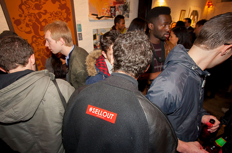
Inevitably, after each art show we host at our other company #SELLOUT, the number one question we got was "How much art did you sell?" 

Well, we sold a bunch of art, if that's what you're wondering, but that question shows that the real value of the show isn't obvious to most people. It's not about the immediate sales (though they are a nice bonus!) it's about brand awareness, this buzz word that is easy to define but difficult to put into action. It's about sales that will be made for years to come. So without further adieu-

I've heard of brand awareness.... Now what?


In this Article:

1. Brand Awareness- insight into the buzzword

2. #SELLOUT- how & why we did it (hint: brand awareness)

3. Applying the big business examples of brand awareness to your small business


brooklyn branding uses art.jpeg


1. BREAKING DOWN THE BUZZWORD: BRAND AWARENESS

Having a badass brand is important, but if your brand is the best-kept secret, it's not really working for you like it should be.

Brand awareness, created by being visible to your target on a consistent basis, ideally strengthened with badass visuals and press-worthy experiences, translates your "brand" into "more people knowing and buying your stuff."

Most branding articles will use examples like the Nike swoosh, or the Apple experience, to demonstrate the strong relationship we have with those brands because of incredibly powerful and consistent brand-awareness campaigns we've experienced over time. But how does this relate to your small business? 


2. SMALL BIZ BRAND AWARENESS EXAMPLE

We created #SELLOUT, an experiential art event, as a brand awareness campaign for artists and sponsors. The goal isn't direct sales, but to create awareness for all parties involved, increasing their value and Brooklyn cool-points by being associated with a scene.
 

HOW WE DO IT

  • Plan shows with artists who are into the idea of shameless self-promotion

  • Pitch the idea to brands who want to be associated with a cool Brooklyn art scene

  • Develop a badass brand that inspires curiosity and has a clear message

  • Design all the materials to reinforce the simple message that everyone can understand

  • Be really clear about the event's message in all press outreach

  • Host events, this past one being a badass, week-long event in Brooklyn with 2 opening parties, interactive art and lots of ways for people to #SELLOUT

TANGIBLE RESULTS 

INTANGIBLE RESULTS

  • All the people who were aware of the events, viewing the marketing campaign, reading the articles, and coming to the parties, have a specific association when they see the logo for #SELLOUT.

  • As we continue to host these events, the people who are currently aware of it will continue to strengthen that association and understanding of the brand, and new people will join that awareness.

Have you ever seen an event with a bunch of "unknown" artists garner that much attention? That's the power of a brand awareness campaign with a badass brand. 


3. HOW THIS RELATES TO YOUR SMALL BUSINESS

The disconnect for many when they read about brand awareness is that it seems like something only large companies can afford because we usually talk about brand awareness in terms of the corporate companies building awareness nationally and worldwide.

But the exact same principles apply to you and YOUR PERSONAL WORLD. Think about all the people in your immediate network: colleagues, friends & family. Don't fall into the trap of thinking that just because they know you and what you do, that they are walking around with you top of mind, referring you whenever the opportunity arises.

What Nike does in brand awareness for the world is exactly what you need to do for the people in your world. Smaller scale, same power.

There are many ways to do it, but the overarching theme is that it must be done consistently and with a consistent message. It's why we are going to take #SELLOUT to SWSX this spring, then Chicago this fall, and then back to Brooklyn in the winter. Repetition is a crucial ingredient.

So whether it's valuable newsletters, or informative seminars, badass parties or fabulous cocktail hours, book clubs or poker nights... find outlets that make sense for your brand and then make sure you do it consistently and over time. This type of effort will create brand awareness, it will pay you back in spades as you become more and more top of mind to everyone who knows you, and it will create exponential value for you the longer you do it.

WHY YOU? HOW TO DIFFERENTIATE FROM THE COMPETITION

“Why should I hire you over the competition? It's THE question that everyone is trying to answer.

"Saying you are unique, or that you think outside the box, is the surest way to let people know you don't think outside the box." - Badass People

"Saying you are unique, or that you think outside the box, is the surest way to let people know you don't think outside the box." - Badass People

Below we've broken it down in to clear, tactical ways you can set yourself apart, with some fun real world examples. 

HOW TO DIFFERENTIATE
FROM THE COMPETITION
LIKE THE BADASS THAT YOU ARE


PART I: BE MEMORABLE: SELL VENTI FRAPPACCINOS™, NOT COFFEE.

Badass brands utilizes new language, language not often used in their industry, as a means of differentiation. It allows them to take something that already exists, put their own spin and personality on it (ahem, brand) and then own it like it's new (because in many ways, it is!)

Starbucks is a great example as it is the only place you can order a Venti Frappuccino and, for a company whose product is 90% water, charge quite a premium on those caffeinated cocktails. Their unique naming system is one of many ways they set themselves apart from their competitors.

Indeed I know many loyal customers that use that terminology when ordering in a non-Starbucks coffeehouse (whoops).

Example amazing brand starbucks

CREATE A NEW CATEGORY

Nespresso created a new category by repackaging an old idea in a new way. Instant espresso had a low-end connotation, so they made up a new word and developed a high-end, high quality image associated with a quality, European espresso. While there are lots of pod coffee machines out there, Nespresso is in a category all on its own.

(To further demonstrate the power of branding did you know that Nestlé owns the company? Not a brand you would associate with European quality espresso, which is probably why they don't advertise that!)

DIFFERENT LANGUAGE

Using different words than your competitors is a great opportunity to set yourself apart. Often, in an attempt to be loved by everyone, companies often use generic words like “quality leadership, delighting customers, great customer service” to express what makes them great to work with.

As a small business owner, what one thing do you do better than everyone else? Large or small, what pieces of your process, your personality or your products are different enough that there is opportunity to highlight, package, and own them as yours? How can you explain it using sepcific, unique words? (Unique not being one of them!)

Instead of saying we are faster and cheaperGeiko say "15 minutes will save you 15% or more on car insurance," a great example of using similar language, but in a differentiated way to be memorable. 

CONCLUSION

You can use new words, you can use the same words in a new way, or you can use made-up words to set yourself apart from your competitors. But when you use language that everyone else is using, no matter how much better you are it will be impossible for the world to see it. 

LITMUS TEST

Read the copy on your competitors’ websites. Is your copy interchangeable with theirs? If it wouldn't feel out of place on your competitors' website then you aren't pushing yourself far enough to show your true colors. Try explaining and defining the generic words that you use, so instead of saying that you are 'innovative,' explain what you mean by the word "innovative."


PART II:

BE BOLD: JUST BECAUSE IT'S TRUE DOESN'T MEAN IT WORKS

Most companies understand that to be successful, a brand needs to stand for something. And we understand that you really do mean it when you say that your company stands for “integrity,” “customer service,” “innovative solutions,” etc… But unfortunately, you’re not the only “honest,” “hardworking” business out there. Those declarations lose meaning when your competitors, especially more established ones, also say they are honest and hardworking. When you all say the same thing, the big guys will always win.

static1.squarespace.png


THE BOLD VALUES TEST

So how do you find something to stand for that is bold, different, badass? There’s a simple way to find out how you are different, and if not, how you can be.  

Ask yourself "what do you stand against?" 

What pisses you off about your industry? If you stand for something bold, you also stand against something real. For example, no company offers "Bad Customer Service," so offering "Good Customer Service" is not very bold, exciting, or even believable. 


SOME BADASS EXAMPLES

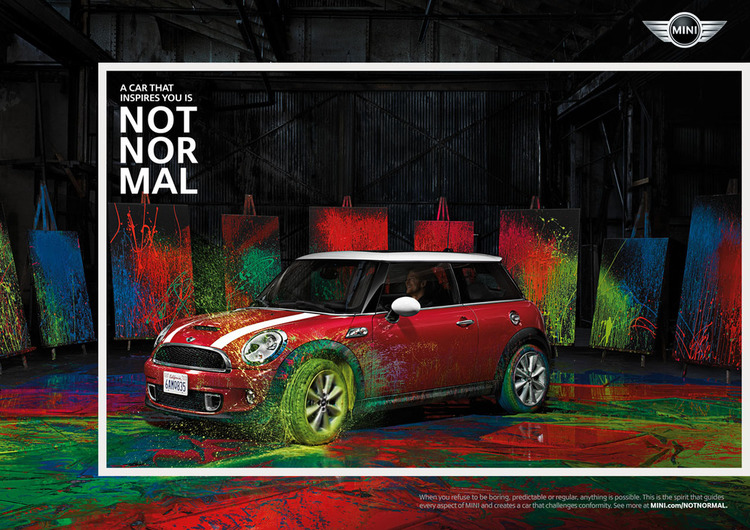
Mini Cooper is against "Normal", because in their words, “Normal can never be amazing”. In-N-Out Burger uses local produce and ingredients so they are against rapid growth and franchising. Chick-Fil-A's owner is a devout southern baptist whose beliefs have strongly influenced the company culture in that they are not open on Sundays, and recently even made public statements in opposition to same-sex marriage. And most people are aware of Ben & Jerry's liberal activism: for example their release of the flavor Hubby Hubby in support of Gay Marriage. 

What offends one person inspires and excites another in every case.
 

HIGHER PROFIT OR HIGHER GROWTH?

While we all might not agree with what these examples stand against, rest assure these brands are all loved by their loyal customers in a way that Toyota, Burger King, & Breyer’s are not. 

And they can charge a premium price because of it, which is part of Worstofall Design's definition of a badass brand. 

On the other hand, though Toyota et. al. are huge, successful companies, they are forced to compete on price and market share.

A brand that actually stands for something different develops devout followers that will pay more for their product, meaning these brands do not have to compete on price. This equates to higher profit margins, which means as the business grows, the profits grow even more than their price-competitive counterparts.

Those are the kind of badass businesses we admire!

Investing in and building on a bold brand message now will garner a loyal following that will shout your brand from the rooftops as you grow! This translates into greater and greater profits in the future. So think about what you stand against, and use that to help find that badass value you stand for. Without a contrary opinion to your stand, you can be pretty sure that big bold statement you’ve been making probably isn’t exciting enough to get your customers moving.


Part III:

BE NARROW-MINDED

You've heard it before: you've got to narrow your target market to be successful. But after encountering business owners time and again who will sell to anyone who will buy, it seems clear many people aren't buying it. Here are 3 short explanations about why narrowing your focus will increase sales, and why being for everyone can be the number one reason your business isn't growing.


WHEN "EVERYONE" IS YOUR TARGET MARKET, YOU ATTRACT NO ONE

If your target market is “anyone with the money to pay” you are doing yourself a disservice. When you hire someone to redecorate your new three bedroom condo, would you prefer to work with someone who “works with all budgets, from small studios to large condos to retail stores and office space” or would you prefer to work with someone who specializes in decorating high-end Manhattan real estate? You might even be willing to pay a premium to work with a specialist. (And even if you're not there are plenty of people who are. Plus when people pay you a premium you don't need nearly as many of them to make the same, or more money!)


STRENGTHEN YOUR BRAND EXPONENTIALLY OVER TIME

Specialize now, and your reputation will grow around you. As you become known for your specialty while your business simultaneously grows, your competitive advantage will only be strengthened as you win client after client, strengthening your reputation and increasing the number of happy clients talking about you in that niche. Your speciality continuously feeds your business more strength and power, a power boost your generalist competitors will never feel. 

Though you might feel, especially at first, like you’re leaving money on the table when you turn down jobs that you could certainly execute, the value you will be creating in your business will pay you back in spades.  


IT'S NOT AS LIMITING AS YOU THINK

Just because you are for a specific group, don’t think you are limited to that group. We’ve found that declaring a niche doesn’t discourage people from asking you if you would do work for clients outside of that niche. Why? Because they like what you have to sell, and they see you more as an expert over your generalist competitors.  Nasty Gal is a great example of a online fashion company that plays to a very specific kind of customer, but many of their customers don’t fall into that category. Their brand is rocker and rebellious targeting a certain kind of female. But that just means they are the go-to for super edgy, rebel style, and even the teachers pet will buy from them when looking for something in that category. They have become the go-to for their style, and that’s powerful across all target markets.
 
Litmus test
What kind of clients do you say “no” to? Do you target clients that other competitors in your space don’t? Do you say no to clients your comeptitors do work with?


WHAT NOW?

Unless you’re Apple, Coke, or Walmart, you don’t have the resources to just beeverywhere, which is how these huge successful companies stay successful.

The rest of us are fighting for a piece of the pie against many other smaller brands. Building a Badass Brand is essential to being successful in the long run because it guarantees you will be known, liked, loved by customers, which will keep them coming back for more, and bringing their friends to boot.
 

HOW DO I MAKE MY BRAND BADASS?

Badass brands are memorable. They stand for something specific or, even better, stand against something that people might even like. They might be very narrow in their target audience, be it the age group, gender, location, size of company, or better yet, a mix of a few. They are willing to sacrifice in the name of their brand. They are authentic. They are valuable. And because they are so well defined, they have little or no competition. 

You can't and shouldn't use all the techniques in this series for your business. Instead, see which ones are most applicable, and then commit! Committing is the hardest part for most because it seems to require sacrifice, but it's truly the strongest way to set your business apart and build a company with unlimited potential.

KNOW YOUR TYPE

IS YOUR FONT HOLDING YOU BACK? 4 MUST READS 


1. FONTS ARE LIKE PEOPLE

Every font has a distinct personality that is influencing how we interpret the words they are expressing, whether you are aware of it or not. Our feelings about typefaces are dictated by factors such as our collective experience, history and culture. Font history geek out session here. 

2. USING THE WRONG FONT FOR YOUR BUSINESS CREATES DISSONANCE, AND THAT LOSES TRUST FROM YOUR MARKET

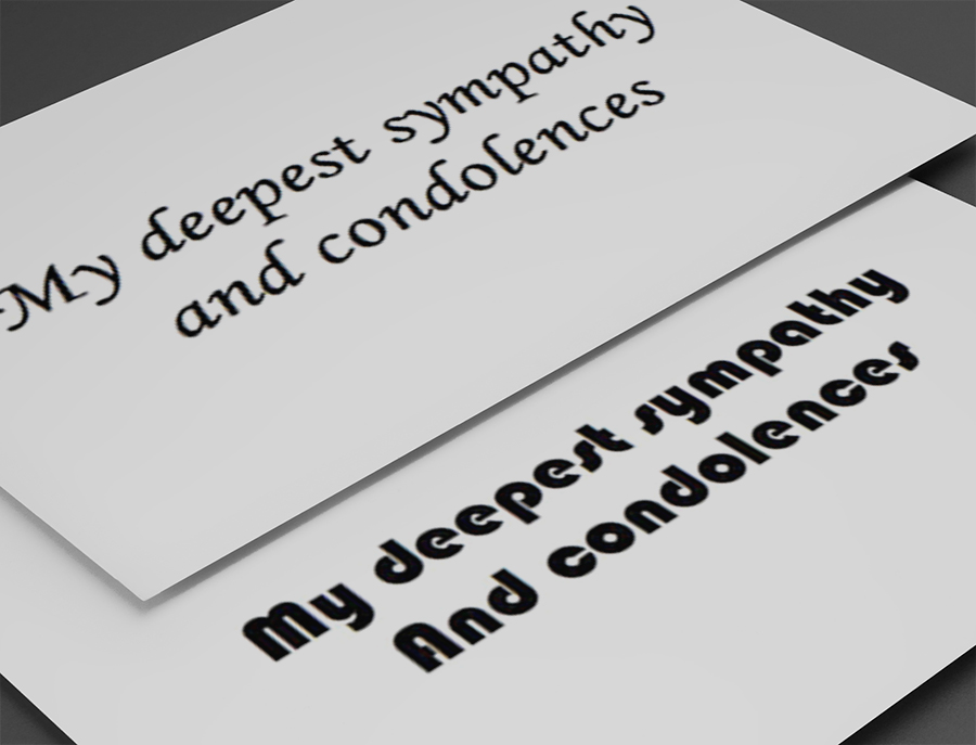
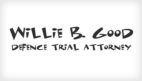
If you're a lawyer charging $800/hour, would you show up to a business meeting in a ripped t-shirt? Likewise are you trying to sell graffiti covered skateboards dressed in a 3-piece suit? Getting the font wrong on your marketing materials, including your website, can be like walking into the meeting in the wrong outfit. Yes, you still showed up, but get the font terribly wrong and people will be subconsciously thinking something that contrasts what you are actually saying. Here's an unfortunate comic font used by a lawyer. Would you take him seriously? 

the importance of fonts in your branding
Would you hire this attorney? Here are some more funny font faux pas

Would you hire this attorney? Here are some more funny font faux pas

learn about font personalities

3. YOUR OPINION MIGHT BE YOUR WORST ENEMY

While you may prefer a thin, script typeface, if your a sporting goods company, it's probably not the best option for you. If you ignore the general perceptions of a font or design choice in favor of  your own personal opinion and you get it wrong, it will hurt your business. As important as it is for you to love your brand, it is equally important to be aware of how your audience will identify with your expression. Therefore the general perceptions of a font's personality should dictate which font is used for your brand over your own personal taste.

4. 1-2-3, LEARN BASIC TYPOGRAPHY

Below are some general font rules that can be applied to your business. These associations are not set in stone but are a good place to start.

Feminine & Elegant

Thinner, more elegant fonts are associated with beauty or femininity and as a result are often applied to women's fashion & lifestyle brands. That's not to say that a thin font cannot be masculine, but it, too, would most likely be associated with men's fashion or lifestyle. 

Masculine & Bold

In contrast to the thin elegant typefaces, heavier, thicker fonts can be more masculine as well, because of their sturdiness and less exclusive than thinner, more sophisticated fonts. 

Case Sensitive

Upper or lowercase characters are an added variable to font personality. An uppercase font is louder, more urgent and commanding than a lowercase font which in comparison seems friendly, understated and even childish or youthful. 

Serif & Sans Serif

Another broad personality perception is the difference between serif and san-serif typefaces. Since serifed fonts were created and used long before san-serifed fonts they don't just feel more classic and traditional, they actually are. Modern typefaces like helvetica are in fact more contemporary than serif fonts like times new roman, and this association is unavoidable. 


FINAL THOUGHTS - HISTORY REPEATS ITSELF

Many times the history of a font is a better indicator as to what its public perception is rather than your individual opinion of it. The list of traits of different fonts and what feeling their distinguishing elements project can go on forever, which is why having an expert with knowledge of typography is imperative for applying fonts to businesses, products and brands. 

WHY YOU NEED IT: RESPONSIVE WEBSITES

I've heard of responsive websites but still don't know what they are! Your questions answered, in laymens terms

WHAT IS A RESPONSIVE WEBSITE AND WHY SHOULD I CARE?

For those that have not heard of responsive web design, please read on for your own sake! This will be the most painless explanation you'll read on the subject, and will let you know when you need responsive and when you don't.

First, let's put responsive design into context: You may remember the mass exodus away from flash websites that coincided with the widespread use of smartphones.  Flash sites do not work on mobile devices nor do they allow the web to read your website's content for SEO purposes. This has made flash, as a website building software, obsolete. The next big shift in the website landscape became the ability to edit and update your own content through user-friendly content management systems (think Wordpress). Now owners can actually update the content on their website themselves, without needing to rely on programmers. Both of these changes have been to the benefit of the website customer and user and responsive is the next movement towards improving your website's effectiveness.

For those that have heard of responsive design, it might already feel like old news in this fast-paced industry.  But for those that haven't, read on so you know what everyone's talking about at your next networking event or cocktail party (or so you can be the one to enlighten everyone.) Here are the basics:


WHAT IS IT?

A responsive website is one that adjusts uniquely to any and all device screen sizes. It eliminates the need to zoom in on a phone or tablet to read the text; everything is always large and legible. Whether you're viewing it on a phone, tablet or desktop monitor, your responsive website will readjust your content to an optimal size for whatever device it is on. Here is an example of a site we designed and how it looks on each screen size:


WHY DO I NEED ONE?

Responsive websites have gained incredible traction in the past year. So much so that if today you hire someone to build you a website and it isn't responsive, consider yourself gypped. As computer sales decrease and tablet & mobile sales increase, more and more people will be viewing your website on a smaller devices of varying screen sizes.  If it is difficult to navigate and read, even at first glance, it may mean lost customers for you. Plus, having a responsive website tells the world that you (and your business) are current, and in the near future it will be regarded as the standard, making static websites look dated.


WHEN DO I NEED A SEPARATE APP?

Here are a few of the most obvious reasons:

  •  When it's important for users to be able to interact with it when they don't have internet (for example on the subway)
  •  When there is a user login and users will constantly be using it (apps allow you to stay logged in, think of your facebook or instagram app)
  •  When your site is very large and high-functioning, but users will only be using a small part of the site when on mobile (for example, amazon.com orairbnb.com)
  •  It's going to have a function that you would only use on your mobile device (for example, mobile banking)
  •  

SO WILL A RESPONSIVE SITE MAKE ME CURRENT, FRESH AND BADASS FOREVER?

For life? No, sorry.  But definitely for now! Technology and its influence on websites is always evolving at an increasingly faster pace.  It's hard to keep up, so befriend someone (like us!) that keeps up on the latest to that you always know where you stand. Whether you pride yourself on being cutting edge or not, your business is always asking for it. If you're just starting out, check out our Badass Brandups, an affordable way to get everything you need, including a responsive website!

If you want to take a stab at it yourself, we highly recommend SquareSpace, which is the only platform we use. 

If you don't know, now you know....


KEEP IT SIMPLE STUPID

K.I.S.S. - THE MAGIC OF SIMPLICITY
3 Things Badass Designers Must Think About to Achieve Impressively Simple Designs

Simplicity is an art. Distilling complex ideas into few words is surprisingly difficult. Business owners know this more than anyone when they start developing their elevator pitch. 

Similarly, a logo at its best should convey a multitude of ideas in the simplest mark possible.  It's not just the mark itself, but the way it is executed. And it's the training and knowledge behind the scenes that makes something simple, powerful.  

Here are 3 things badass designers must think about to achieve that simplicity

KISS- Keep It Simple Stupid

KISS- Keep It Simple Stupid

1. WHAT YOUR BUSINESS SELLS

What is your company about? Sometimes creating a mark that is representative of what you sell is powerful, especially when executed properly.  Sometimes, something less literal that presents an a-ha moment is more powerful.


2. YOUR COMPANY PERSONALITY

Every aspect of your logo adds to the personality of your brand, and  color is a big one as it affects mood and comes with intrinsict meaning. We all have associations with colors that are connected to our daily lives, and there lies an opportunity to tap into people's memory to create a connection with their personal experiences. Basic examples like STOP signs being red, plants being green, etc... are ideas that can be utilized to add to the depth and should be taken into account when creating a visual message.


3. YOUR PRICE POINT

Matching your brand to your price point is critical to a professional and polished brand, and anything off the mark can create unrealistic expectations that will lose sales when they are about to close. The font used and finishing touches go a long way to tell a consumer what they can expect to pay, and when they are ready to buy, it will be a seamless process if the price is in the ballpark they were expecting.


Let's take a look at a brilliantly simple example, the FedEx logo.  

The font is clean and bold because the personality of the company is straight forward: they will simply always deliver your package on time. 

The colors are meant to address a key company goal: to utilize the fact that there are FedEx trucks everywhere and that the CEO wanted to "be able to see a FedEx truck loud and clear from five blocks away." 

fed-ex.jpg

Finally, the mark.   An arrow is such a simple, obvious and not terribly interesting representation of movement. Yet its brilliance lies in its execution. This is a great example of an a-ha moment, because the arrow isn't immediately apparent, but when you see it, it feels extremely smart (which, not coincidentally is a major personality trait of FedEx.)

Lindon Leader the designer, had this to say about it: I tell people this all the time. Henny Youngman, the comedian, had this whole signature to his act around ‘Take my wife. Please.’ What the PR folks wanted to do was the equivalent of changing his shtick to ‘Please, take my wife.’ If you have to call attention to your punch line, to explain it, it’s no longer a punch line. It doesn’t work, it isn’t funny, and no one will remember it.”

By utilizing the right font and appropriate colors, matched with great execution, FedEx has achieved a powerful and appropriate logo that has stood the test of time. Each element is very simple, but the power lies knowing to bring them together. 


Is there a difference between "true" art and commercial art?

To me they are more the same than different. Milton Glasser takes as much joy in seeing his design for a commercial clock mass-produced as I do making a one-of-a-kind piece of sculpture. The more I thought about this admittedly loaded question the more I feel it should be recast through the lens of the nature of artistic collaboration.

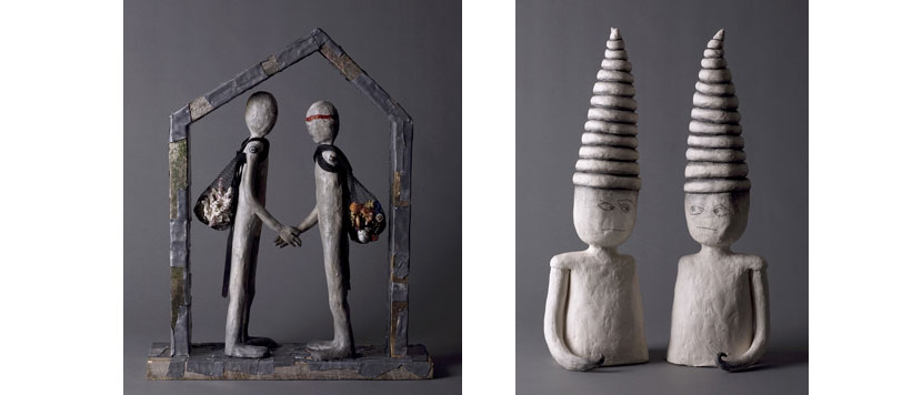
I currently have on view in NYC an exhibition entitled THE TALKING CURE. “The Talking Cure," takes its name from Sigmund Freud’s original description of psychoanalysis. The exhibition consists of twelve mixed material sculptures, each accompanied by an interactive audio track created by a literary collaborator. I asked twelve writers- poets, novelists, screenwriters, and playwrights- to each chose a sculpture to which they relate most intimately. Each wrote his or her imagined monologue in the sculpture's mind. Actors then transformed the written work into audio recordings. When the viewer points a Smartphone, Blackberry or I-Phone reading device at the QR tag accompanying each sculpture, it triggers audio to hear the inner voice of the artwork. There is also a recording station at the gallery, at which anyone can record his or her own monologue for one of my sculptures, and I will make a sculpture from the monologue. From image, to words, to words to image, it brings it all full circle.

For me the core of this project is about “letting go,” on several levels. When I asked the twelve writers to imagine a monologue for of my sculptures, my own story, motivation and artistic universe yielded to theirs. The writers in turn had to let go of their written work when the actors were given the monologues to interpret for recording. Like the process of psychotherapy, which is in theory about letting go, we each had to both create and then let that creation go out into world. I was delighted and amazed by the works that my literary collaborators produced. A few of the writers had a little more trouble letting go of their words and more than one actor was uneasy with their “reading” of the text. It’s been a fascinating experience in creation and psychology.

Fine art can be thought of as the art of highly individual expression placed before a broader public. It is meant to express the soul of the artist, and it hopes to reach the hearts and minds of an audience, sometimes a highly select one. Commercial art could be defined as art- or production work- made for the masses, attempting to excite or interest the individual. At the core of both activities is a willing collaboration between artist and audience, often with a host of intermediaries in between- from gallery or manufacture, to distributor, marketer, ad agency or art critic, each a part of the artistic food chain. My latest work- an exhibition of fine art on which I collaborated with myriad writers, actors, and technology partners- explores- indeed toys with- the notion of collaboration, the disappearing distinction between audience and artist, and the blurred line between fine art and group production.

It‘s this act of “letting go” that is the critical element in any creative act, whether fine art or commercial. It’s the one thing that makes or breaks any work of art, be it made for a client or to express ones purest inner feelings. It’s that actor who lets it rip in a performance, the writer who is unafraid to be emotionally naked on the page, the graphic designer who goes outside of the box to solve a creative problem and yes, the visual artist who able and willing to share the world inside their head with the rest of us.

- Artist Melissa Stern www.melissa-stern.com

The exhibition is up until Dec. 22- Smart Clothes Gallery 154 Stanton St ( corner of Suffolk, one block below Houston) Wed- Sun, 12- 6:30 or by appointment. 212.627.3276 smartclothesgallery.com